The difference between frustrating AI images and breathtaking ones isn't talent or luck — it's learning to speak the visual language the machine understands.
I still remember the exact moment everything changed. It was 2 AM on a Tuesday night. I had been staring at my screen for hours, cycling through prompt after prompt, watching ChatGPT spit out images that looked nothing like what I had envisioned. Fingers with impossible anatomy. Text that melted into gibberish. Characters that seemed to actively resist my intentions. I was ready to give up on AI image generation entirely — to dismiss it as overhyped technology that only worked for other people.
Then I tried something different. Instead of describing what I wanted to see, I described what a camera would capture. Instead of asking for "a beautiful sunset," I wrote "golden hour light streaming through mountain peaks, shot on Canon 5D Mark IV, 24-70mm lens at f/2.8, natural color grading." The image that appeared wasn't just acceptable — it was stunning. Photorealistic. Exactly what had existed only in my imagination moments before.
That single shift in perspective unlocked everything. Over the following months, I went deep. I generated thousands of images. I tested every technique I could find. I read OpenAI's documentation cover to cover. I experimented with GPT Image 1.5 the day it launched. And now I'm going to share everything I learned — not the surface-level tips you'll find everywhere else, but the deep knowledge that separates professionals from hobbyists. This is the guide I wish existed when I started. This is how you go from frustrated beginner to confident creator.
My Journey Into AI Image Generation
Let me take you back to where this all started. Like many of you reading this, I was initially skeptical about AI image generation. "It's just a toy for tech enthusiasts," I thought. "Real creative work still requires real skills." I couldn't have been more wrong.
My first real need for AI images came from a practical problem. I was creating content for a project and needed cover images — lots of them. I had been paying for stock photos, shelling out money for generic shots that every other creator was using too. The images were fine, but they lacked soul. They felt borrowed, not owned.
A friend mentioned that ChatGPT could generate images now. "Just describe what you want," she said. "It's like magic." So I tried it. My first prompt was embarrassingly naive: "A beautiful sunset over mountains." The result? A smudgy mess that looked like a watercolor painting left out in the rain. I was underwhelmed, to say the least.
But something kept pulling me back. I tried again. And again. Each failure taught me something new about how the AI interpreted language. I started noticing patterns — certain phrases that consistently produced better results, structural approaches that guided the model toward my vision rather than away from it.
The breakthrough came when I realized: AI image generation isn't about describing what you see in your mind — it's about describing what a camera would capture in reality. That single shift in perspective changed everything.
I stopped thinking like a dreamer and started thinking like a photographer. Instead of "beautiful sunset," I wrote about golden hour light, specific camera models, lens focal lengths, aperture settings, film stocks. The AI understood this language because it was trained on millions of images that came with exactly this kind of technical metadata.
Over the following months, I became obsessed. I generated thousands of images across every style and use case I could imagine. I read every piece of documentation OpenAI published. I joined communities of creators pushing the boundaries of what was possible. And when GPT Image 1.5 launched in January 2026, I was ready. I understood not just how to use it, but why it worked the way it did.
Now I'm going to share everything I've learned. Not the surface-level tips you'll find in a hundred other guides. The deep knowledge that comes from extensive experimentation, systematic testing, and countless conversations with other creators who are pushing these tools to their limits. This is the complete guide — the one that will take you from confused beginner to confident creator.
What is ChatGPT Image Generator
Before we dive into techniques, let me clarify exactly what we're working with. The ChatGPT image generator is OpenAI's integrated image creation and editing system, currently powered by their GPT Image 1.5 model. Unlike standalone tools like Midjourney or Stable Diffusion, it's deeply integrated into ChatGPT's conversational interface.
This integration matters more than you might think. Because ChatGPT understands context, it can maintain consistency across multiple generations, remember your preferences within a session, and even reason about what you're trying to create. Tell it you're working on a children's book, and it adjusts its style accordingly. Mention you need images for a corporate presentation, and it shifts toward clean, professional aesthetics. This contextual awareness is something standalone image generators simply can't match.
🎨 Text-to-Image Generation
Describe anything in natural language and watch it materialize. From photorealistic portraits to abstract art, from product mockups to fantasy landscapes — if you can describe it, the AI can create it.
✏️ Precision Image Editing
Upload existing images and modify them with text commands. Change colors, swap objects, adjust lighting, transform seasons, or completely reimagine the scene while preserving elements you want to keep.
🔄 Style Transfer
Take the visual language from one image — its palette, texture, brushwork, or aesthetic — and apply it to entirely new content. Perfect for maintaining brand consistency or creating cohesive series.
📝 Reliable Text Rendering
Finally, AI that can actually spell. GPT Image 1.5 handles text in images with unprecedented accuracy — perfect for logos, posters, infographics, and marketing materials where words matter.
How It Actually Works
When you send a prompt to ChatGPT's image generator, several things happen behind the scenes. First, ChatGPT itself processes your request, potentially expanding or clarifying your prompt based on context. It might add details you implied but didn't state, or structure your request in a way the image model better understands.
Then the request goes to the image generation model — currently GPT Image 1.5 — which transforms your text description into visual output. This model was trained on an enormous dataset of images paired with detailed descriptions, learning the intricate relationships between language and visual elements.
The result is a system that genuinely understands what you're asking for, not just pattern-matching keywords. Ask for "a photorealistic candid moment" and you get something that genuinely feels unposed. Request "morning light through venetian blinds" and you get the specific stripe pattern that creates.
GPT Image 1.5 achieved first place on Artificial Analysis Image Arena for both text-to-image generation and image editing, with a 90% instruction compliance rate — 13 percentage points higher than its closest competitor. This isn't marketing speak; it reflects a genuine leap in capability.
The GPT Image 1.5 Revolution
When OpenAI released GPT Image 1.5 in January 2026, they didn't just iterate on their previous model — they rebuilt the foundation. I had been using earlier versions extensively, so I immediately noticed the difference. This wasn't an incremental improvement; it was a paradigm shift.
Let me be specific about what changed, because understanding these improvements will help you leverage them effectively.
The Three Breakthroughs That Matter
Previous models had a frustrating tendency to drift. You'd ask to change one thing, and three other things would shift unexpectedly. Fix the lighting, and suddenly the character's face looked different. GPT Image 1.5 genuinely understands "change only this element" — it can modify specific parts while preserving lighting, composition, facial features, even subtle textures. This makes iterative refinement actually practical.
Generation speed increased up to 400% compared to previous versions. What used to take 30 seconds now takes 7-8. But more importantly, you can queue new generations while current ones are still processing. This transforms the creative process from "submit and wait" to "explore and iterate." The psychological difference is significant — faster feedback loops mean more experimentation.
Text rendering in AI images has historically been a disaster — misspellings, duplications, letters that melt into abstract shapes. GPT Image 1.5 handles dense, small text while maintaining proper typography, layout, and legibility. This opens up infographics, marketing materials, UI mockups, and any use case where words appear in images. For the first time, I can generate presentation slides, social media graphics with captions, and product labels that I'd actually use.
Understanding Quality Settings
GPT Image 1.5 offers different quality tiers, and understanding when to use each will save you time and improve your results. This isn't just about output quality — it's about matching the right tool to the right task.
⚡ Low Quality Mode
Don't let the name mislead you — "low quality" here means "fast and efficient." The results are still remarkably good for most use cases. Use this for:
- Initial concept exploration and brainstorming
- Quick iterations when refining ideas
- Simple compositions without fine detail
- High-volume generation where speed matters
- Drafts before committing to final versions
✨ High Quality Mode
When every pixel matters and you need publication-ready results. Reserve this for:
- Final production images for delivery
- Dense text and typography work
- Complex infographics with small details
- Photorealistic portraits where texture matters
- Any image where you need maximum fidelity
The Hidden Input Fidelity Setting
Here's something most guides won't tell you: when editing images, there's a parameter called input_fidelity that dramatically affects results. Set it to "high" when you need to preserve facial features, maintain identity across edits, or make significant scene changes. The model works harder to maintain the original image's key characteristics.
result = client.images.edit(
    model="gpt-image-1.5",
    input_fidelity="high",  # The secret sauce for identity preservation
    quality="high",
    image=[open("portrait.png", "rb")],
    prompt="Change the background to a sunset beach while preserving the person's exact appearance"
)
This combination ensures maximum preservation of the original subject while applying your requested changes.
The biggest shift with GPT Image 1.5 isn't technical — it's philosophical. Image generation moves from "prompt and pray" to "instruct and iterate." This requires a completely different mental model for how you approach visual creation.
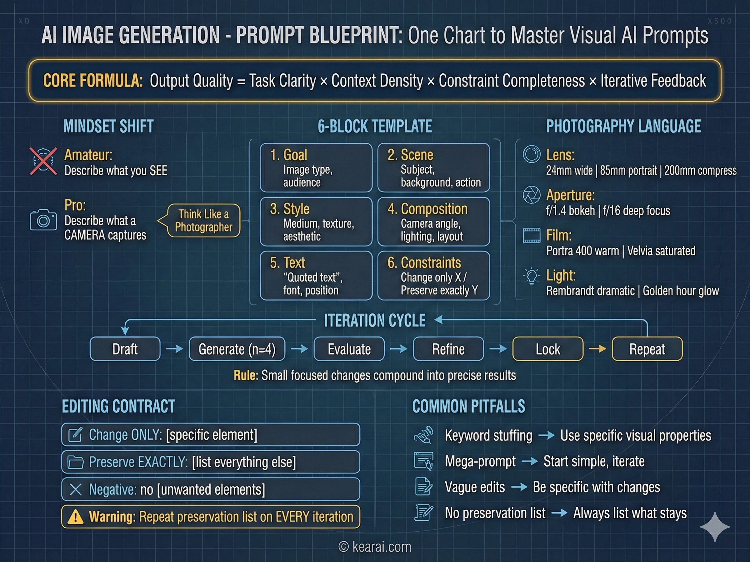
The Prompt Framework That Changed Everything
After generating thousands of images, I developed a framework that consistently produces exceptional results. Forget everything you've read about adding "masterpiece, trending on ArtStation, ultra-detailed, 8K resolution" to your prompts. Those keywords worked for older models that needed quality cues, but GPT Image 1.5 responds to structure and specificity, not keyword stuffing.
I call it the structured prompt architecture, and every effective prompt I write now follows this pattern.
Goal/Output:
- [Type of image: ad, UI mockup, infographic, photo, illustration]
- [Intended use and audience]

Scene:
- [Background/environment description]
- [Main subject with specific details]
- [Action or relationship between elements]

Style:
- [Medium: photograph, watercolor, 3D render, vector illustration]
- [Key textures: matte, glossy, grainy, smooth, organic]
- [Quality descriptors: realistic imperfections, stylized, minimalist]

Composition/Layout:
- [Camera position: close-up, wide shot, aerial view, eye-level]
- [Lighting: golden hour, studio strobes, overcast, dramatic shadows]
- [Element placement: centered, rule of thirds, negative space, margins]

Text (if any):
- "Exact text in quotes"
- [Font style, size, color, position]
- [Specify: render only once, no duplicates]

Constraints:
- Change ONLY: [specific element if editing]
- Preserve exactly: [elements that must stay unchanged]
- Negative: no watermark, no extra text, no logos, no [unwanted elements]
This framework gives the model clear context for every visual decision it needs to make.
The Seven Principles of Effective Prompting
Beyond structure, these principles govern how I write every prompt. They're the difference between images that almost work and images that nail your vision.
Structure Over Keywords
Use a consistent order: background → subject → details → constraints. For complex requests, use labeled sections or line breaks. Long paragraphs confuse the model; organized structure guides it toward your intention.
Specificity Over Superlatives
Instead of "high quality" or "ultra-detailed," describe actual visual properties. Materials, textures, shapes, mediums. "Visible skin pores and subtle freckles" beats "highly detailed face" every time.
Explicit Composition Control
Name your framing (close-up, wide shot, bird's eye), perspective (eye-level, low-angle, Dutch angle), and lighting mood (soft diffuse, golden hour, high-contrast rim light). Don't leave these to chance.
The Change vs. Preserve Contract
For editing, explicitly state what should change AND what should remain untouched. Use "change only X" and "preserve exactly Y." Repeat this preservation list on every iteration to prevent drift.
Text Demands Precision
Put required text in "quotes" or ALL CAPS. Specify font style, size, color, and position. For difficult words or brand names, spell them out letter-by-letter. Always add "render exactly once, no duplicates."
Multi-Image Reference Clarity
When working with multiple input images, reference each by index and description: "Image 1: the product shot, Image 2: the style reference." Explicitly state how they should interact.
Iterate Rather Than Overload
Start with a clean base prompt, then refine with small, single-change follow-ups. "Make the lighting warmer." "Remove the background tree." Small steps compound into precise results.
The Most Common Mistake
The biggest error I see people make: trying to specify everything in one massive prompt, hoping the model figures it out. This almost never works well. Start with a simpler prompt to establish the base, then iterate with targeted refinements. You'll get better results in less time with far fewer frustrating failures.
The Photography Mindset
The single biggest improvement in my results came from a mental shift: I stopped thinking like an artist describing a vision and started thinking like a photographer describing a shot. This isn't just a metaphor — it's a practical technique that leverages how the model was trained.
AI image models learned from millions of photographs that came with metadata: camera models, lens specifications, aperture settings, lighting conditions. When you use this language, you're activating the model's deep understanding of how real cameras capture real scenes.
Photography Language That Works
- Lens choice: "24mm wide angle" creates expansive scenes with distortion at edges; "200mm telephoto" compresses depth and isolates subjects
- Aperture feel: "f/1.4 bokeh" gives creamy background blur for portraits; "f/16 deep focus" keeps everything sharp for landscapes
- Film stocks: "Kodak Portra 400" for warm, flattering skin tones; "Fuji Velvia" for punchy, saturated landscapes; "Ilford HP5" for contrasty black and white
- Lighting setups: "Rembrandt lighting" for dramatic portraits; "butterfly lighting" for beauty shots; "golden hour backlight" for ethereal glowing edges
- Camera movement: "long exposure motion blur" for dynamic energy; "high-speed freeze frame" for capturing action
Instead of saying "make it look professional," try "shot on Hasselblad medium format, studio strobe lighting, seamless gray backdrop, color-calibrated for print reproduction." Instead of "realistic portrait," try "candid photograph, 85mm f/1.4 lens, window light from camera left, subtle fill from reflector, visible skin texture with pores, shot on Sony A7R IV."
❌ BEFORE (Vague):
"A beautiful portrait of an old fisherman, very detailed, high quality, realistic"

✅ AFTER (Photography Mindset):
"Candid documentary photograph of an elderly fisherman on a weathered wooden boat.
Weathered face with visible wrinkles, sun spots, and pores. Deep-set kind eyes.
Gray stubble. Faded traditional anchor tattoo on forearm. Salt-stained navy wool
sweater, worn cap.

Early morning coastal light, soft fog diffusing the sun. Medium close-up at eye
level, 50mm lens, f/2.8, shallow depth of field. Shot like 35mm film with subtle
grain, natural color balance.

Documentary style — honest, unretouched, capturing a real moment. No glamorization."
The photography mindset transforms vague wishes into precise visual specifications the model understands deeply.
When you describe images using photography language, you're not just being more specific — you're speaking a language the model was trained to understand. Camera specifications, lighting setups, and film stocks aren't arbitrary keywords; they encode precise visual information the model can decode accurately.
Text-to-Image Mastery
Creating images from pure text descriptions is where most people start their AI image journey. It's also where the gap between amateur and professional results is most visible. Let me walk you through the techniques that consistently produce outstanding results across different use cases.
Photorealistic Images That Feel Natural
The key to photorealism is counterintuitive: you need to prompt for imperfection. Perfect skin, perfect lighting, perfect composition — these scream "AI generated." Reality is messier, and that messiness is what makes images feel authentic.
Create a photorealistic candid photograph of an elderly sailor standing on a small fishing boat.

Subject: Weathered face with visible wrinkles, sun spots, and pores. Deep-set kind
eyes with crow's feet. Gray stubble, a few days unshaven. Faded traditional anchor
tattoo on forearm. Salt-stained navy wool sweater, worn and pilled. Creased cap
with faded insignia.

Setting: Early morning on the water, soft coastal fog diffusing the light. Aged
wooden boat deck with peeling paint, fishing nets in background, coiled rope.

Technical: Shot like 35mm film photography, medium close-up at eye level, 50mm
lens, shallow depth of field with boat blurred behind him. Subtle film grain,
natural color balance without heavy grading.

The image should feel like a real moment captured by a photojournalist — honest,
unposed, with real skin texture, worn materials, and everyday imperfection. No
glamorization, no heavy retouching, no artificial perfection.
Notice how we explicitly request imperfections — weathered skin, worn materials, peeling paint. Reality has texture.
Infographics and Data Visualization
The improved text rendering in GPT Image 1.5 makes infographics a genuinely practical use case. I now create professional-quality information graphics that I actually use in my work.
Create a detailed infographic explaining how a coffee machine works.

Structure:
- Title at top: "The Journey of Your Morning Coffee"
- Vertical flow diagram showing: bean hopper → grinder → portafilter →
  grouphead → water heating → extraction → cup
- Each step has an icon and 1-2 sentence explanation
- Warm color palette (browns, creams, copper accents)
- Clean, modern design with plenty of white space
- Subtle coffee stain texture in background corners

Style: Professional print-quality infographic, vector-style icons, clear
hierarchy, readable at A4 size.

Typography: Clean sans-serif headings, readable body text, clear visual
hierarchy between title, section headers, and explanatory text.

No watermarks. No stock photo elements. Original illustration only.
For dense text and complex layouts, always use quality="high" to ensure text remains crisp and readable.
Logo and Brand Design
Logo generation requires prioritizing simplicity and scalability. A great logo works at any size, from a tiny favicon to a massive billboard. Here's how to prompt for designs that actually function as logos.
Create an original logo for "Field & Flour" — a local artisan bakery.

Brand personality: Warm, authentic, handcrafted, timeless. Not trendy or corporate.

Design requirements:
- Clean vector-style shapes with strong silhouette
- Balanced negative space
- Must read clearly from 16px favicon to large signage
- Flat design, minimal strokes, no gradients unless essential
- Earth-tone palette: warm wheat gold, deep brown, cream
- Could incorporate subtle wheat or grain element
- Text must be perfectly legible and properly kerned

Output: Single centered logo on plain cream background. Generous padding around
the design for flexibility.

No watermarks, no mockups, no 3D effects, no complex imagery. Simple, functional,
timeless design.
Use n=4 to generate multiple variations. Logo design is subjective — give yourself options to choose from.
UI and App Mockups
For UI design, describe the interface as if it already exists and is shipping to real users. Concept art language produces concept art. Product language produces usable mockups.
Create a realistic mobile app UI mockup for a local farmers market app.

Screen content (from top):
- Simple header with market name "Riverside Market" and search icon
- Today's featured vendor carousel with square photos
- "Fresh Today" section with produce category chips (Vegetables, Fruits, Dairy, Baked)
- Vendor list with small photos, names, specialties, and distance
- Bottom navigation: Home, Map, Favorites, Cart, Profile

Design language:
- White background, subtle natural green accents
- Clear typography hierarchy (system fonts feel)
- Generous padding and touch-friendly targets
- Looks like a real shipped product, not a concept
- Uses realistic vendor names and produce photos

Frame: Place the UI inside an iPhone 15 Pro device frame, slight perspective
tilt, subtle shadow beneath.
Focus on layout, hierarchy, spacing, and realistic interface elements. Avoid conceptual or artistic language.
Comic Strips and Sequential Art
Creating multi-panel comics requires defining the narrative as a sequence of clear visual beats, one per panel. Keep descriptions concrete and action-focused.
Create a 4-panel vertical comic strip. Equal panel sizes, clear panel borders.

Panel 1: Pet owner walks out the front door, keys in hand. Through the window
behind them, we see their cat watching — paws pressed against glass, eyes wide
with apparent sadness. The house suddenly feels empty.

Panel 2: The door clicks shut. The cat slowly turns away from the window toward
the empty house. Its posture shifts from forlorn to interested. Eyes narrow with
possibility.

Panel 3: Total chaos. Cat sprawled across the forbidden couch like royalty.
Knocked over plant on the floor. Papers scattered. Sunbeam spotlighting the
scene of domestic crime.

Panel 4: Door handle turns. Cat sits perfectly upright by the entrance,
composed and innocent, tail wrapped neatly around paws. Not a hair out of
place. As if nothing happened.

Style: Warm illustrated style with expressive characters, clear visual
storytelling that reads without text. Consistent character design across
all panels.

No speech bubbles or text. Let the visuals tell the story.
Define each panel as a distinct visual beat with clear action. The model handles panel layout and visual continuity.
Children's Book Illustrations
Children's book illustration requires a specific approach: memorable character design, warm accessible style, and compositions that work with text overlays.
Create a children's book illustration introducing the main character.

Character: Young forest hero, around 8 years old.
- Green hooded tunic (think woodland adventurer, not Robin Hood)
- Soft brown boots, well-worn
- Small belt pouch for collecting treasures
- Carries a tiny wooden bow (symbolic, for helping not hurting)
- Kind expression, bright curious eyes, brave but gentle demeanor
- Slightly oversized head for picture book proportions

Theme: This character protects and rescues small forest animals in trouble.

Style: Hand-painted watercolor look with soft outlines, warm earthy palette
with forest greens and autumn oranges. Whimsical, friendly, inviting for
young readers ages 4-8.

Composition: Character standing in simple forest glade, dappled sunlight,
leaving room for title text above. Character clearly showcased.

Original character design only. No text. No watermarks. No copyrighted
character references.
Save this character reference image — you'll use it to maintain consistency across subsequent illustrations.
Leveraging World Knowledge
One of GPT Image 1.5's most underappreciated capabilities is its built-in world knowledge. The model can infer context from subtle cues, generating historically and culturally appropriate imagery without explicit instruction.
Create a realistic outdoor crowd scene in Bethel, New York on August 16, 1969.

Photorealistic, period-accurate clothing, staging, and environment.

Documentary photography style, shot on film, natural lighting.
The model knows this is Woodstock without being told. It generates hippies, period fashion, the festival atmosphere — all from the date and location alone.
This world knowledge extends to architecture across eras, fashion through decades, cultural events, geographic landmarks, artistic movements, and even specific photography aesthetics. When accuracy matters, providing time and place often produces better results than lengthy descriptions of what you expect to see.
The Art of Precision Editing
Text-to-image generation is impressive, but image editing is where GPT Image 1.5 truly shines. The ability to precisely modify existing images while preserving everything else opens professional workflows that were previously impossible without expert Photoshop skills.
The Golden Rule of Editing
Every successful edit follows the same pattern: explicitly state what changes, explicitly state what stays the same. This sounds obvious, but the level of specificity required is greater than most people realize.
Always structure editing prompts as: "Change ONLY [X]. Preserve EXACTLY: [comprehensive list of everything else]." Then repeat your preservation list on every follow-up edit to prevent gradual drift from the original.
Virtual Clothing Try-On
E-commerce is being transformed by AI try-on capabilities. Here's the prompt structure I use for clothing swaps that maintain identity perfectly.
Edit the image to dress this person in the provided clothing items.

MUST PRESERVE (do not change in any way):
- Face, facial features, expression, skin tone
- Body shape, proportions, and pose
- Hairstyle and hair color
- Background and environment
- Camera angle, framing, and composition
- Overall lighting direction and quality

CHANGE ONLY:
- Replace current clothing with provided garment images
- Fit garments naturally to body geometry
- Show realistic fabric draping, folds, and behavior
- Match lighting and shadows on fabric to original photo

REQUIREMENTS:
- Photorealistic integration — outfit should look worn, not pasted
- Maintain color temperature of original image
- No accessories, text, logos, or watermarks added
- Identity must remain clearly recognizable
For virtual try-on, always use input_fidelity="high" to ensure facial likeness is maintained.
Style Transfer
Style transfer takes the visual language from one image — its palette, texture, brushwork, aesthetic — and applies it to new content. This is invaluable for maintaining brand consistency or creating cohesive series.
Using the EXACT visual style of the reference image (Image 1), create:
A man riding a motorcycle on a winding mountain road.

STYLE ELEMENTS TO MATCH PRECISELY from reference:
- Color palette and saturation levels
- Line quality and weight
- Texture treatment and brushwork
- Lighting style and direction
- Level of detail vs. abstraction
- Overall artistic aesthetic

APPLY TO NEW CONTENT:
- Single subject (man on motorcycle)
- Clear composition with visual interest
- Mountain road environment with curves
- Sense of motion and freedom

The new image should look like it came from the same artist or series as
the reference. Maintain stylistic consistency exactly.
Style transfer works best when you're specific about which style elements to preserve and which content elements to change.
Object Replacement
Swapping objects while maintaining photorealism is now practical. The secret is describing not just what to add, but how it should integrate with the existing scene.
In this room photo, replace ONLY the white plastic chairs with
mid-century modern wooden chairs (walnut finish, tapered legs,
woven seat).

PRESERVE COMPLETELY:
- Camera angle and perspective
- Room lighting direction and quality
- All other furniture and objects
- Wall colors and decorations
- Floor material and shadows
- Overall image quality and color grading

INTEGRATION REQUIREMENTS:
- Chairs must match room's perspective exactly
- Wood grain should catch existing light realistically
- Contact shadows must be natural and match light source
- Scale must be accurate relative to table height
- New chairs should look like they belong in this room

Photorealistic result — should look like the original photograph.
Interior design visualization is one of the most commercially valuable editing applications.
Sketch to Photorealistic Render
Transforming rough sketches into polished renders is incredibly useful for product design, architecture, and concept development. The prompt needs to treat the sketch as a specification to follow.
Transform this hand-drawn sketch into a photorealistic image.

PRESERVE FROM SKETCH:
- Exact layout and proportions
- Perspective and viewing angle
- Element placement and relationships
- Implied depth and layering

ADD FOR REALISM:
- Appropriate real-world materials and textures
- Consistent natural lighting (interpret from sketch shading)
- Environmental context matching the implied setting
- Surface imperfections and wear appropriate to materials

CONSTRAINTS:
- Do not add new elements not present in sketch
- Do not add text or watermarks
- Treat the sketch as an architectural blueprint to follow exactly
- Fill in realistic details while honoring the original composition
The model interprets the sketch's intent and fills in realistic details while maintaining the original composition.
Lighting and Weather Transformation
Changing environmental conditions while preserving scene geometry is one of my favorite editing applications. Perfect for creating seasonal variants, time-of-day alternatives, or mood adjustments.
Transform this daytime summer scene into a winter evening with snowfall.

CHANGE:
- Time of day: from afternoon to dusk (warm interior lights visible)
- Season: summer to deep winter
- Weather: clear to active snowfall
- Ground: grass to fresh snow coverage
- Trees: summer foliage to bare branches with snow
- Atmosphere: add visible breath if people present
- Surfaces: add frost on windows and metal

PRESERVE:
- Camera position and angle exactly
- All objects and their exact positions
- Architecture and structural elements
- People and their poses (update clothing appropriately)
- Overall composition and framing

Style: Photorealistic, natural atmospheric perspective, visible
snowflakes in air, cozy contrast between warm interior lights and
cold exterior. Should feel photographed, not filtered.
Use input_fidelity="high" and quality="high" for best results on environmental transformations.
Multi-Image Compositing
Combining elements from multiple source images requires clear instruction about what comes from where and how elements should integrate seamlessly.
I'm providing 2 images:
- Image 1: Beach scene with woman standing on shore at sunset
- Image 2: Golden retriever sitting in a studio setting

Task: Place the dog from Image 2 into the beach scene from Image 1,
positioned next to the woman, looking up at her.

MATCHING REQUIREMENTS:
- Dog's lighting must match beach sunset (warm golden light from left)
- Scale dog appropriately relative to woman's height
- Dog should cast shadow consistent with scene's sun angle
- Sand texture should show around and under dog's paws
- Fur should catch the same golden hour highlights as scene

PRESERVE FROM IMAGE 1:
- Woman's exact appearance, position, and pose
- Beach background completely unchanged
- Original photo's color grading and mood

The composite should look like a single photograph taken on location.
No visible compositing artifacts.
Reference images by number and be explicit about which elements transfer and which stay fixed.
Text Translation in Images
Localizing visual content for international markets is dramatically simplified with GPT Image 1.5's text capabilities.
Translate all text in this infographic from English to Japanese.

MUST PRESERVE:
- Exact layout, spacing, and positioning of all elements
- All visual elements, icons, illustrations, and graphics
- Typography hierarchy (headlines vs body text relationships)
- Color scheme and overall design aesthetic
- Font weights and relative sizes

TRANSLATION REQUIREMENTS:
- Accurate Japanese translation with natural phrasing
- Match visual weight and style to original fonts
- Adjust character spacing for Japanese typographic norms
- No text truncation or overflow outside original bounds

Do not modify any non-text elements. Only change the language.
This workflow handles marketing materials, UI screenshots, packaging, and infographics without rebuilding from scratch.
Advanced Techniques for Professionals
Once you've mastered the fundamentals, these advanced techniques will elevate your work to truly professional levels. These are patterns I've developed through extensive experimentation — techniques that consistently produce superior results.
Character Consistency Across Images
One of the biggest challenges in AI image generation is maintaining character consistency across multiple images. For children's books, brand mascots, or any project requiring the same character in different scenes, here's my proven workflow.
Generate a detailed reference image that establishes the character's definitive appearance. Include all key details: outfit, proportions, expression, color palette. Save this image — it becomes your source of truth.
Write a detailed text description of the character that you'll reference in all future prompts. Be specific about every visual element. This textual anchor supplements the visual one.
When creating new scenes, always include the anchor image as input and explicitly instruct "maintain exact character appearance from reference image."
The model maintains context within a conversation session. Build on successful images rather than starting fresh for each scene. Reference previous generations directly.
Continue the children's book story using the character from the reference image.

New Scene:
The same young forest hero is gently helping a frightened squirrel out
of a fallen hollow tree after a winter storm. Snow on the ground, bare
branches above, warm light filtering through clouds.

CHARACTER CONSISTENCY (from reference):
- Same green hooded tunic, exact shade and style
- Same soft brown boots
- Same belt pouch
- Same facial features, proportions, and color palette
- Same gentle, heroic personality in expression
- Same children's book proportions

STYLE CONSISTENCY (from reference):
- Same watercolor illustration style
- Same soft outlines
- Same warm earthy color treatment
- Same whimsical, friendly aesthetic

New elements: winter forest environment, frightened squirrel, fallen
tree with hollow.

Do not redesign the character. Do not change the artistic style.
No text. No watermarks.
Reference the anchor image and repeat key character details to maintain consistency across the entire book.
The 3D Stylized Portrait Technique
Creating hyper-stylized 3D portraits from reference photos has become one of my signature outputs. The key is extreme specificity about the desired aesthetic.
Create a hyper-stylized 3D floating head portrait based on this person.

STYLE CHARACTERISTICS:
- Smooth skin with glossy vinyl-finish surface
- Strong highlighter on cheekbones and nose tip catching soft light
- Holographic, iridescent eyeshadow (purple to teal color shift)
- Thick hair sculpted in slick, glossy waves like polished acrylic
- Small metallic chrome nose piercing with brushed reflections

EXPRESSION:
Confident, slightly unimpressed look — half-lidded eyes, subtly
arched brow, the sophisticated "too cool" attitude.

TECHNICAL SPECIFICATIONS:
- Head floats isolated against plain white background
- Slight 15-degree tilt (premium product render feeling)
- Bright, diffuse studio lighting with no harsh shadows
- Emphasis on glossy, plastic, subsurface scattering effects
- Ultra-smooth textures throughout
- Close-up portrait angle, straight-on, 85mm lens feel

The result should look like a high-end 3D character render or
collectible figure — plastic perfection with personality.
This level of aesthetic detail produces remarkably consistent results across different subjects.
Chibi Character Transformation
Converting photos into adorable chibi-style characters works surprisingly well for brand mascots, social media avatars, and merchandise.
Transform this person into an adorable chibi-style character.

CHIBI PROPORTIONS:
- Tiny body (about 1 head-height tall)
- Oversized head (3x body proportions)
- Large, sparkling eyes with cute highlights
- Soft, rounded facial features
- Cheerful, expressive pose with personality

PRESERVE FROM ORIGINAL:
- Recognizable facial features (simplified but identifiable)
- Hairstyle, length, and hair color
- Distinctive clothing style or accessories
- Any notable characteristics (glasses, jewelry, etc.)
- Overall personality and vibe

STYLE:
- Smooth pastel shading
- Clean lines and simplified details
- Bright, expressive colors
- Collectible figure aesthetic

Background: Simple gradient or plain color to showcase character.

The result should feel like an irresistible chibi mascot that
clearly represents the original person.
Chibi transformations work well for personal branding, team avatars, and merchandise designs.
Marketing Creatives with Perfect Text
Creating marketing materials with accurate text requires strict typography control and explicit text specifications.
Create a realistic highway billboard mockup featuring this product.

BILLBOARD CONTENT:
- Product bottle prominently displayed on left third
- Main headline on right (EXACT TEXT, render verbatim):
  "Fresh & Clean — Every Day"
- Tagline below headline: "Nature's Best Ingredients"
- Small logo placeholder area in bottom right corner

TYPOGRAPHY SPECIFICATIONS:
- Headline: Bold sans-serif, white text, high contrast
- Tagline: Light sans-serif, slightly smaller, same white
- Clean kerning, centered alignment within text area
- Text appears EXACTLY ONCE — no duplicates anywhere

SCENE:
- Billboard on highway overpass or roadside structure
- Sunset lighting creating warm, appealing atmosphere
- Photorealistic environment with motion-blurred vehicles below
- Professional advertising photography feel

No watermarks. No additional marketing copy. No logos unless
specified. Text must be perfectly legible and correctly spelled.
Always use quality="high" for marketing materials with text. Verify spelling before final use.
Product Photography Extraction
Creating clean product shots with isolated subjects is essential for e-commerce. Here's the prompt that works.
Extract the product from this image for e-commerce use.

OUTPUT SPECIFICATIONS:
- Transparent background (RGBA PNG format)
- Crisp silhouette with clean edges
- No halos or color fringing around product
- All product labels and text perfectly preserved
- Exact product geometry and proportions maintained

OPTIONAL ENHANCEMENT:
- Add subtle, realistic contact shadow
- Shadow should be soft and natural, no hard edges
- Shadow works with the transparent background

CRITICAL CONSTRAINTS:
- Do NOT restyle or recolor the product
- Do NOT modify product appearance in any way
- Only remove background and add optional shadow
- Preserve every detail of the original product exactly
Note: Current model renders checkerboard pattern for transparency — may need post-processing for true alpha channel.
Known Limitation
Background removal currently renders a visual checkerboard pattern to indicate transparency rather than producing true RGBA transparency in the output file. For production use, you may need to post-process the output to convert the checkerboard to actual transparency using image editing software.
The Iterative Refinement Loop
Don't try to achieve perfection in a single prompt. Professional results come from systematic iteration.
The Refinement Process
- Generate: Create initial image with core elements and overall composition
- Evaluate: Identify the 1-2 most important issues to address first
- Refine: Fix only those specific issues, explicitly preserving everything else
- Lock: Save current state before attempting the next iteration
- Repeat: Continue until satisfied, building incrementally
Each small, focused change compounds into precise final results with far less frustration than attempting everything at once.
Real-World Professional Workflows
Theory is valuable, but seeing how techniques combine into complete workflows is where understanding crystallizes. Here are the workflows I use most frequently in professional practice.
E-Commerce Product Photography Pipeline
Complete Product Visual System
- Product extraction: Remove backgrounds from raw product photos, create clean isolated shots
- Lifestyle contexts: Generate environmental scenes (kitchen, office, outdoor) and composite products into them
- Color variants: Create product color variations through targeted editing without reshooting
- Marketing creatives: Generate billboard mockups, social media graphics, banner ads with product integration
- Localization: Translate text in marketing materials for different markets while preserving design
A complete product photography pipeline that previously required studio time, Photoshop expertise, and multiple specialists now runs through a series of AI prompts.
Content Creator Visual Library
Building Consistent Brand Assets
- Character development: Create brand mascot or personal avatar with detailed anchor image
- Style guide generation: Produce color palette references, mood boards, and aesthetic examples
- Thumbnail factory: Generate consistent YouTube/social thumbnails using established character and style
- Background library: Create scene backgrounds that match brand aesthetic for various content types
- Variation expansion: Use style transfer to maintain visual consistency across all new content
Build your visual foundation once, then iterate efficiently. Creates the kind of brand consistency that previously required a dedicated design team.
Rapid Design Prototyping
From Concept to Visual in Minutes
- Rough sketch: Hand-draw basic concept (napkin quality is fine — rough shapes and layout)
- Initial render: Convert sketch to photorealistic or stylized image preserving your composition
- Iteration cycle: Refine through targeted edits ("warmer lighting," "different material," "more contrast")
- Variant exploration: Generate multiple variations (n=4) for client presentation or decision-making
- Final polish: High-quality export of selected direction with refined details
Designers report dramatically faster concept iteration compared to traditional digital creation workflows.
Children's Book Illustration Pipeline
Creating Consistent Illustrated Books
- Character design: Create detailed character reference sheet establishing definitive appearance
- Style establishment: Generate 2-3 sample pages to lock down illustration style, pick the best
- Scene-by-scene generation: Work through story page by page, always referencing both character and style anchors
- Consistency review: View all pages together, use editing to fix any character drift or style inconsistencies
- Final refinement: Polish individual pages as needed while maintaining established look
The anchor image approach makes consistent character illustration across an entire book genuinely achievable.
The Mistakes That Were Killing My Results
After watching myself and countless others struggle with AI image generation, I've identified the patterns that separate success from frustration. Here are the mistakes I used to make — and how I fixed them.
❌ Keyword Stuffing
The mistake: Adding "highly detailed, 8K, photorealistic, trending on ArtStation, masterpiece" to every single prompt.
The fix: Describe specific visual properties instead. "Visible skin pores, morning window light, 50mm lens depth of field" communicates far more than generic quality keywords.
❌ The Mega-Prompt
The mistake: Trying to specify every possible detail in one massive prompt, hoping the model somehow figures out my complete vision.
The fix: Start simple. Get a solid base image first, then refine with targeted follow-up prompts. Building incrementally produces far better results.
❌ Vague Edit Instructions
The mistake: Saying "make it better" or "fix the lighting" without specifying what "better" means or how lighting should change.
The fix: Be specific about the change. "Shift lighting from harsh overhead to soft window light from the left, with warmer color temperature."
❌ Forgetting the Preservation List
The mistake: Requesting changes without explicitly stating what should remain unchanged, then being surprised when other elements drift.
The fix: Every edit prompt includes explicit preservation requirements. Repeat them on each iteration because the model doesn't remember previous constraints.
❌ Context Amnesia
The mistake: Starting fresh conversations for related images, losing all the context and consistency built up.
The fix: Build within sessions for related work. Reference previous generations directly. Use phrases like "same style as the previous image" to leverage context.
❌ Wrong Quality Settings
The mistake: Always using high quality (slow and expensive for iteration) or always using low quality (missing crucial detail when it matters).
The fix: Match settings to the task. Low quality for exploration and iteration; high quality for final outputs and anything with text.
❌ Fighting the Model
The mistake: Running the exact same prompt repeatedly, expecting different results, or forcing a direction the model consistently resists.
The fix: If a prompt isn't working, rephrase rather than repeat. Different words activate different patterns. Sometimes your approach needs to change, not just the model's output.
❌ Ignoring Stochasticity
The mistake: Expecting identical results from identical prompts, getting frustrated when outputs vary.
The fix: Generate multiple variations (n=4) and choose the best. Embrace the variability as a source of creative options rather than a flaw to overcome.
The single most impactful change most people can make: stop treating prompts as wishes and start treating them as specifications. Be as precise as you would be in a design brief for a human collaborator. The model is remarkably capable — but it needs clear direction to show that capability.
API Integration for Developers
If you're integrating GPT Image 1.5 into applications programmatically, here are the technical details and best practices you need.
Basic API Setup
import os
import base64
from openai import OpenAI

client = OpenAI()

# Create output directory
os.makedirs("output_images", exist_ok=True)

def save_image(result, filename: str) -> None:
    """Save base64 image response to file."""
    image_base64 = result.data[0].b64_json
    with open(f"output_images/{filename}", "wb") as f:
        f.write(base64.b64decode(image_base64))

# Basic text-to-image generation
result = client.images.generate(
    model="gpt-image-1.5",
    prompt="Your detailed prompt here",
    quality="high",  # or "low" for faster iteration
    n=1  # number of variations
)

save_image(result, "output.png")
Image Editing with Multiple Inputs
result = client.images.edit(
    model="gpt-image-1.5",
    input_fidelity="high",  # Essential for identity preservation
    quality="high",
    image=[
        open("input_images/source.png", "rb"),
        open("input_images/style_reference.png", "rb"),
    ],
    prompt="""
    Apply the artistic style from Image 2 to the subject in Image 1.

    PRESERVE: subject's identity, pose, and composition
    CHANGE: artistic style, color palette, texture treatment

    Do not add new elements. Maintain subject likeness exactly.
    """
)

save_image(result, "styled_output.png")
Key API Parameters
Generation Parameters
model
"gpt-image-1.5" — the latest flagship model with best capabilities
prompt
Your text description — structure matters more than length
quality
"high" for detail and text work, "low" for speed and iteration
n
Number of variations to generate (1-4 typically, higher for exploration)
Editing Parameters
image
File object or list of file objects for multi-image inputs
input_fidelity
"high" for identity preservation, critical for portrait work
Pricing Considerations
API Cost Structure
- Token-based pricing: Costs scale with resolution and quality settings
- 1MP high quality: Approximately $133 per 1,000 images
- 1MP low quality: Approximately $9 per 1,000 images
- Cost savings: Image input/output costs are 20% lower than GPT Image 1
For high-volume applications, always start with low quality and upgrade only for final outputs or text-heavy images.
How It Compares to Other Tools
I've spent significant time with every major AI image generation tool. Here's my honest assessment of how ChatGPT's image generator (GPT Image 1.5) stacks up against the competition.
GPT Image 1.5 vs Gemini 3.0 Pro Image
GPT Image 1.5 wins: Instruction compliance (90% vs 77%), text rendering accuracy, precision editing, API integration quality
Gemini 3.0 Pro wins: Overall image quality on some benchmarks, creative interpretation, complex multi-figure scenes
My take: GPT Image 1.5 for professional work requiring precision and consistency; Gemini for creative exploration where you want more interpretation
GPT Image 1.5 vs Midjourney
GPT Image 1.5 wins: Instruction following, image editing capabilities, API access, text rendering, predictable results
Midjourney wins: Artistic aesthetics and "wow factor," community and sharing features, painterly styles
My take: GPT Image 1.5 for professional/commercial work where you need specific outcomes; Midjourney for artistic exploration and concept art
GPT Image 1.5 vs DALL-E 3
GPT Image 1.5 wins: Editing capabilities, speed (4x faster), consistency across iterations, instruction compliance
DALL-E 3 wins: Nothing significant — GPT Image 1.5 is the successor and improves on every dimension
My take: If you're still using DALL-E 3, upgrade immediately. GPT Image 1.5 is strictly better.
GPT Image 1.5 vs Stable Diffusion
GPT Image 1.5 wins: Ease of use, no setup required, instruction following, text rendering, consistent quality
Stable Diffusion wins: Full customization, local control, unlimited free generation, fine-tuning, specialized models
My take: GPT Image 1.5 for speed and ease; Stable Diffusion for control, customization, and cost-conscious high-volume work
In benchmark testing, GPT Image 1.5 achieved #1 position in both text-to-image and image editing categories on Artificial Analysis Image Arena. For production work requiring reliable, predictable results with precise control, it's currently the best option available.
The real answer? The best tool depends on your specific needs. I maintain access to multiple tools because each excels at different things. But if I could only have one for professional work, I'd choose GPT Image 1.5 for its reliability, precision, and editing capabilities.
Power User Secrets
These are the tips that took me from "pretty good" to "professional quality" results. Each one was learned through extensive experimentation and sometimes painful failure.
Start Fresh for New Projects
Begin each new project in a new conversation. Context from old projects can leak into new generations and cause unexpected results. Clean slate, clean results.
The 80/20 Rule
Get 80% right in the first generation. Use editing for the final 20%. Trying to achieve perfection in a single prompt leads to frustration and wasted time.
Specific Beats Superlative
"Shot on medium format film with natural grain" beats "ultra-high-quality amazing detailed" every time. Specifics guide the model; superlatives just add noise.
Quote Your Text
Always put required text in "quotes" and specify it should appear "exactly once, no duplicates." This prevents the duplication and spelling errors that plague text rendering.
End with Negatives
End every prompt with what you don't want: "No watermarks, no text unless specified, no logos, no excessive saturation, no artificial bokeh." Prevention beats correction.
Save Your Winners
When you get a great result, save both the image AND the complete prompt. Build a personal library of proven prompts you can adapt for future projects.
Rephrase, Don't Repeat
If a prompt isn't working, don't run it again hoping for luck. Rephrase it. Different words activate different patterns in the model. Change your approach.
High Quality for Text Always
Whenever your image includes text — any text at all — use high quality mode. Low quality text is often illegible, making the speed savings worthless.
Understanding Stochasticity
Here's something crucial: AI image generation is fundamentally stochastic. The same prompt can produce different results each time. This isn't a bug — it's the nature of the technology.
Embrace the Variance
Instead of fighting randomness, use it. Generate 4 variations and pick the best one. Sometimes the "unexpected" interpretation leads somewhere better than what you originally imagined. The best AI artists I know lean into happy accidents while maintaining enough control to meet their goals. Variability is a feature, not a flaw.
Troubleshooting Common Issues
After thousands of generations, I've encountered every problem imaginable. Here's how to fix the most common issues that frustrate creators.
Problem: Text Is Misspelled or Duplicated
Solution
Put exact text in quotes: "RESTAURANT" not restaurant. Add explicit instruction: "render exactly once, no duplicates." For difficult words, spell letter-by-letter: "R-E-S-T-A-U-R-A-N-T". Always use quality="high" for any image containing text. Verify output before using.
Problem: Character Looks Different Across Images
Solution
Create a detailed character anchor image first and save it. Include this anchor as input for every subsequent generation. Write a character bible listing every visual detail. Explicitly instruct "maintain exact character appearance from reference image." Use input_fidelity="high" in API calls. Work within single sessions when possible.
Problem: Edits Change More Than Requested
Solution
Be more explicit about preservation. Structure prompts as "Change ONLY: [X]. Preserve EXACTLY: [list everything else in detail]." Repeat the full preservation list on every edit iteration — the model doesn't remember previous constraints. Use input_fidelity="high" for important elements.
Problem: Images Look Obviously "AI Generated"
Solution
Add realistic imperfections: "subtle film grain," "slight lens vignette," "natural skin texture with pores and subtle blemishes," "dust particles visible in sunbeam," "minor wear on materials." Perfection looks fake. Reality is messy. Describe what cameras actually capture, not idealized versions.
Problem: Colors Look Oversaturated or Unnatural
Solution
Specify color treatment explicitly: "natural color grading," "true-to-life colors," "muted earth tones," "not oversaturated," "color-accurate." Reference specific film stocks for color guidance: "Kodak Portra color science" or "documentary color grading." Add "realistic color balance, no HDR look."
Problem: Background Removal Creates Halos or Artifacts
Solution
Request explicitly: "transparent background (RGBA PNG format), crisp silhouette, no halos, no color fringing, clean edges, no artifacts." Note that current model renders checkerboard pattern for transparency — post-processing may be needed for true alpha channel in production.
Problem: Compositions Feel Unbalanced or Awkward
Solution
Specify composition explicitly: "subject positioned using rule of thirds," "centered with symmetrical framing," "generous negative space on left for text overlay," "eye-level camera angle," "subject fills 60% of frame." Don't leave composition to chance — describe exactly what you want.
The Future of AI Image Generation
We're living through a revolution. What was science fiction two years ago is now a commodity anyone can access. But we're still in the early chapters of this story. Here's what I see coming.
What's On the Horizon
🎬 Seamless Video Integration
The line between still images and video is blurring rapidly. Expect smooth transitions from image generation to animated sequences within the same interface. Early versions are already here (Sora, Runway), and they're improving fast. Your image prompts will become video prompts with minimal adaptation.
🎯 Perfect Consistency
Character and style consistency across unlimited images without manual effort. The anchor-and-reference workflow will become automatic. Train the model on a few examples of your character, and it maintains perfect consistency forever. The "drift" problem will be solved completely.
✏️ Real-Time Collaborative Editing
Interactive editing where you paint, drag, and manipulate elements conversationally in real-time. Imagine Photoshop where every brush stroke triggers an AI response, and complex edits happen through conversation rather than technical tools.
🎨 Personal Style Learning
Train the model on your aesthetic with a handful of examples. Your own personal AI artist that understands your taste, your brand, your visual language — and applies it consistently to everything you create.
The Democratization of Visual Creation
What we're witnessing is nothing less than the democratization of visual creation. Skills that once required years of training — product photography, graphic design, illustration, concept art — are becoming accessible to anyone who can describe what they want to see.
This doesn't eliminate the value of human creativity. If anything, it elevates it. When execution becomes easy, vision becomes everything. The people who thrive in this new landscape won't be those who can render the most realistic hands — the AI handles that now. They'll be those who have something worth saying, something worth showing, something that moves people.
The photographers who thrived in the transition from film to digital weren't those who resisted change. They were those who embraced new tools while maintaining their artistic vision. AI image generation is the same kind of transition, just more dramatic and faster.
The best AI-generated images will always be created by people who understand both the technology AND the art. Master the tools, but never forget that tools serve vision. The technology amplifies human creativity — it doesn't replace it.
Final Thoughts
Thumbnails, graphics, and social content in minutes instead of hours
Product photography, variants, and marketing at unprecedented scale
Rapid concepting and client presentations that used to take days
Robust programmatic access for building image-enabled applications
Natural language makes entry easier than traditional design tools
Quality and consistency sufficient for commercial work
I started this journey frustrated and skeptical. I'd heard the hype about AI image generation but repeatedly hit the wall between marketing promises and practical reality. Fingers with impossible anatomy. Text that melted into abstract shapes. Compositions that actively fought my intentions. I was ready to dismiss it all as overhyped technology.
Then I learned to speak the machine's language. I stopped describing what I wanted to see and started describing what a camera would capture. I stopped hoping for luck and started building systematically. I stopped fighting the model and started collaborating with it.
GPT Image 1.5 didn't just improve on previous problems — it fundamentally changed my relationship with visual creation. I now think in terms of prompts and iterations rather than brushes and layers. I approach visual challenges with confidence that there's a prompt structure that will produce what I need. The images I create today would have taken days to produce just two years ago. The ideas I can explore are limited only by imagination, not technical skill.
The learning curve is real. You won't master this overnight. But the principles in this guide — structure over keywords, specificity over superlatives, iteration over perfection, the photography mindset — will compress weeks of frustrating experimentation into focused, productive learning.
More than anything, I hope this guide gives you what I wish I had when I started: not just techniques, but a mental model. An understanding of how this technology interprets language, what it responds to, and how to speak its visual language fluently.
The gap between the images in your mind and the images on your screen has never been smaller. And with the right approach, that gap continues to shrink with every prompt you write.
Now go make something beautiful.
I remember that 2 AM moment when everything clicked — when the image that appeared wasn't just acceptable, but exactly what I had envisioned. That feeling is available to you now. The technology has arrived. The techniques are documented. The only thing left is your imagination and your willingness to learn a new language. The ChatGPT image generator isn't just a tool — it's a creative partner that amplifies human vision in ways we're only beginning to understand. Welcome to the future of visual creation. The images you've been seeing in your mind? They're closer to reality than they've ever been.
Discussion
0 commentsLeave a comment
Be the first to share your thoughts on this article!